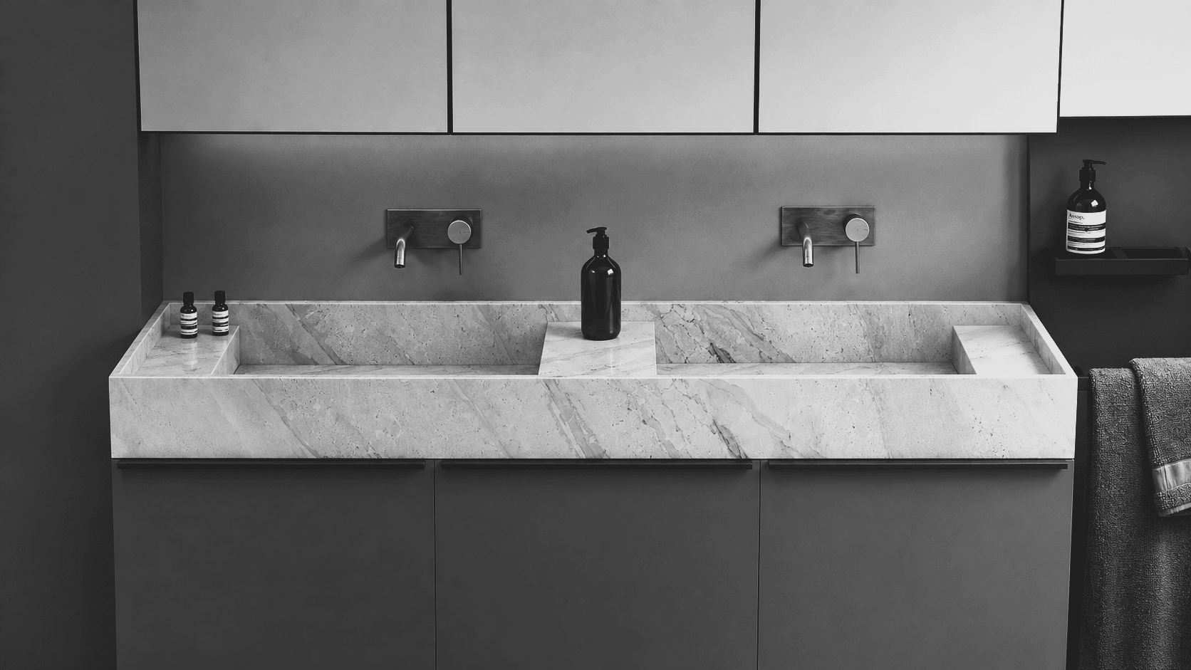
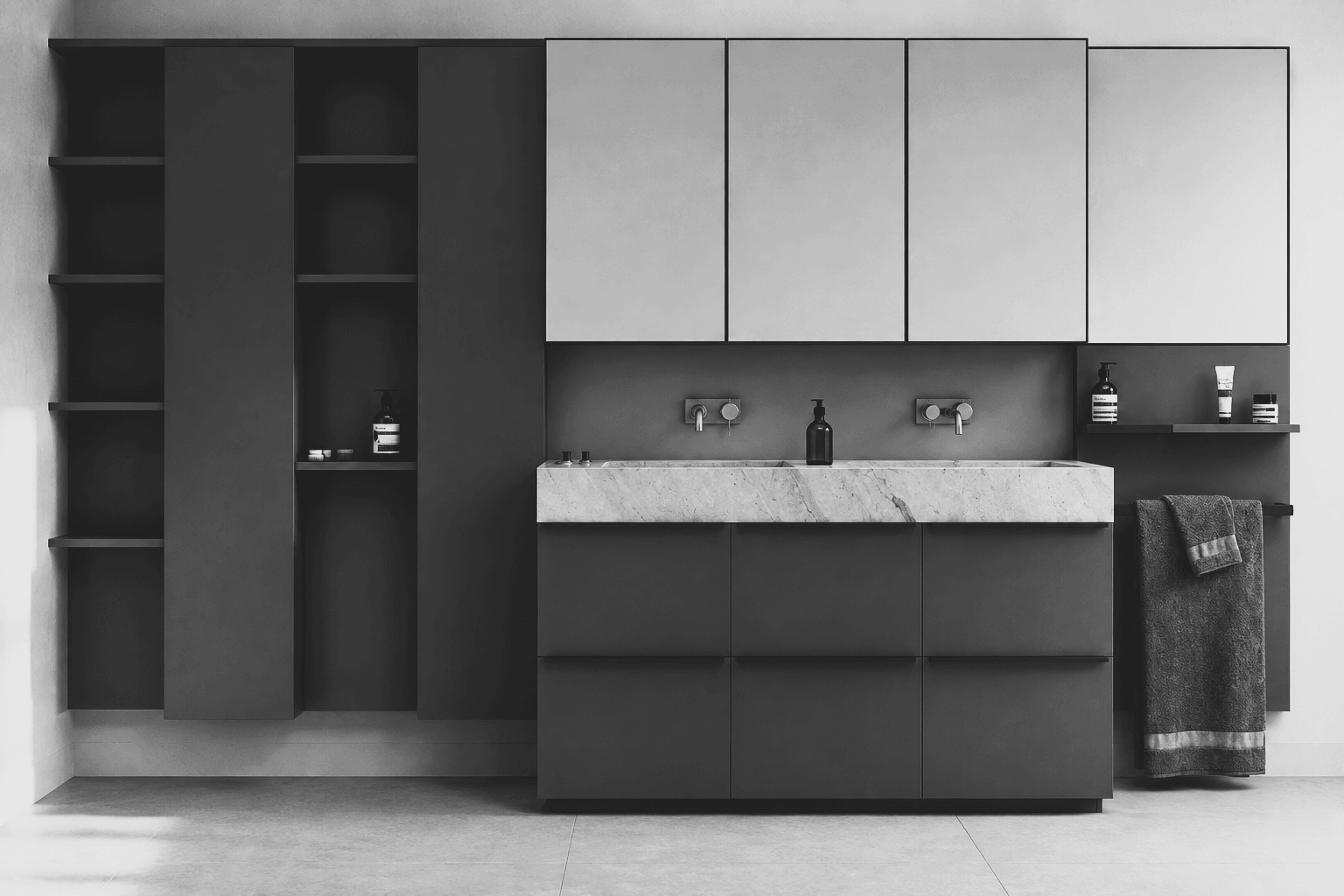
The case fora narrow palette
Why we work with fewer materials, and use texture rather than colour to create difference within a room.
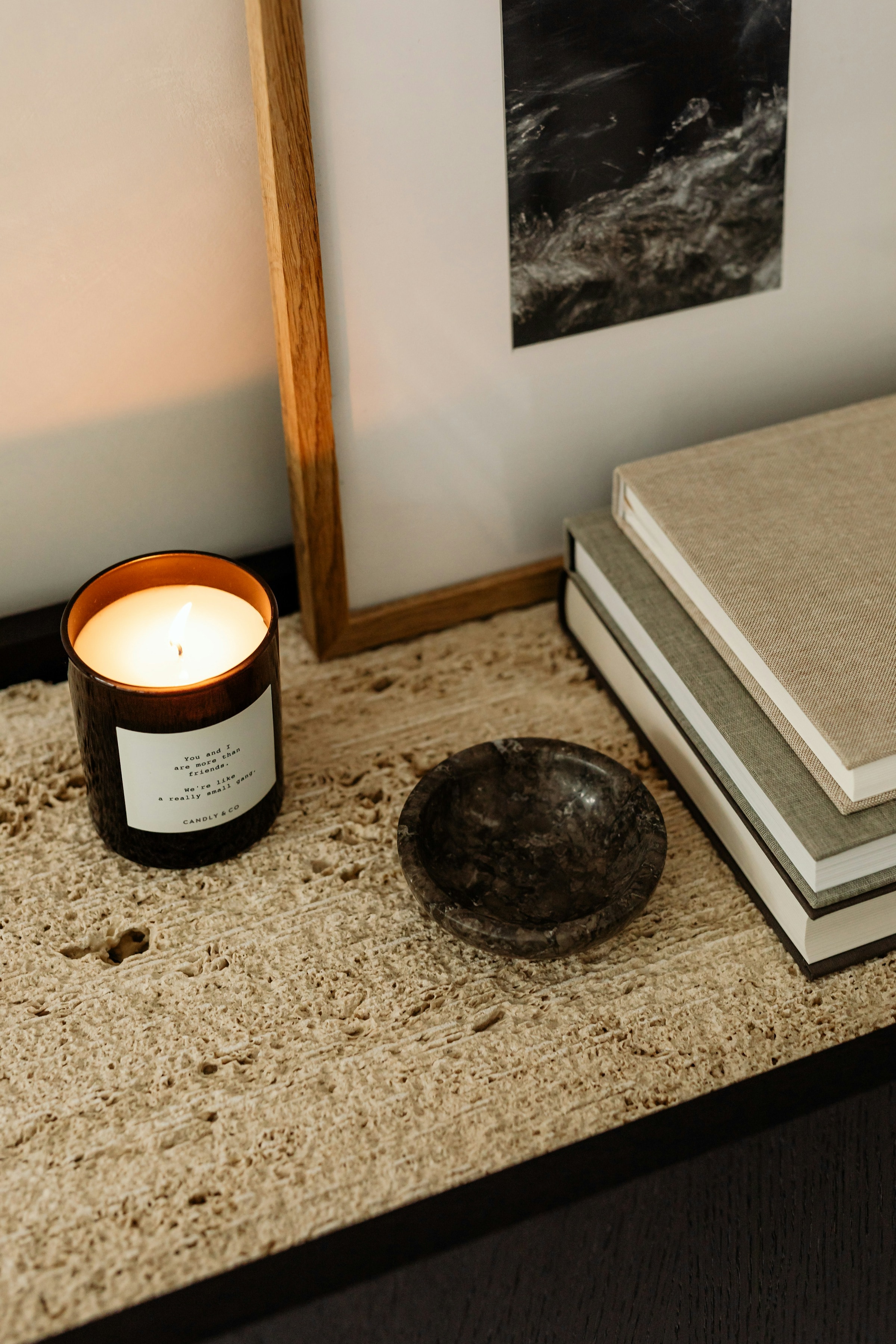
A narrow palette is often read as a restriction. In practice it does the opposite: it removes the need to reconcile competing materials and frees the remaining decisions to be made carefully.
When a single stone tone runs across the walls, the floor and the counter, difference has to come from somewhere else. It comes from texture — a honed face against a lightly textured one — and from the way light meets each surface.
Texture as the second material
Changing the surface rather than the substance keeps a room quiet while still giving the eye something to register. A textured wall reads as a different material to a honed one under raking light, but the two remain unmistakably related.
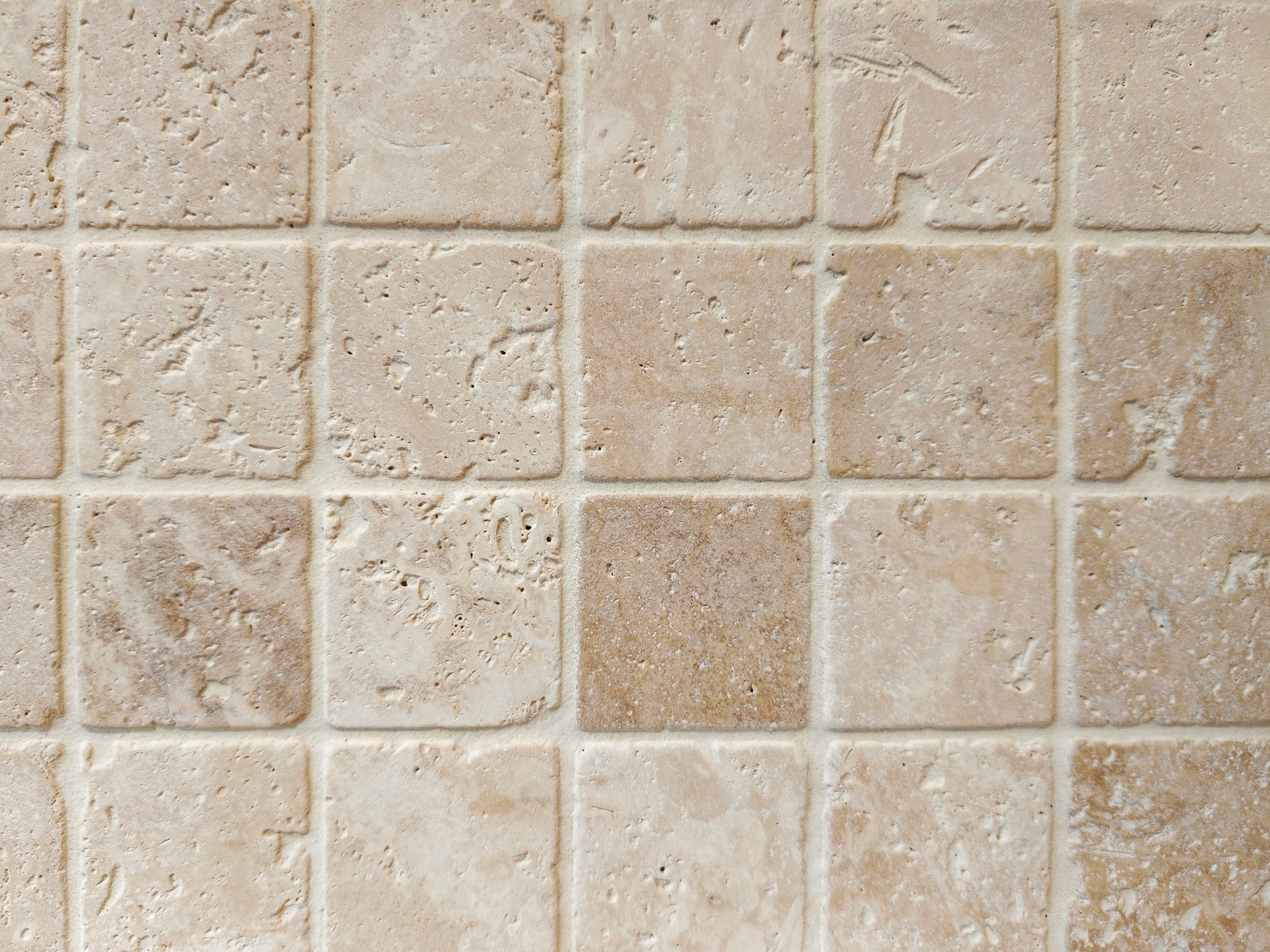
“Difference should be felt before it is noticed.”
The practical benefit is longevity. A room built from two or three materials can absorb a change of furniture, a new fitting or twenty years of use without losing its logic. A room built from nine cannot.
Where contrast earns its place
Restraint elsewhere is what allows one deliberate contrast to work. Matt black brassware against a stone-toned wall registers as a drawn line precisely because nothing else in the room is competing for that role.
Used more widely, the same fitting would become a finish. Used sparingly, it stays a detail.